— role
UX/UI design
Branding
Cover More people brand
After being acquired by Zurich, Cover-More needed to define its market image and employer brand. They came to us (We Are Unity) to help them strengthen their people's culture.
project background
Founded in Australia, Cover-More is now a global travel insurance and medical assistance provider with offices across Australia, New Zealand, China, US, UK, India, Canada, Malaysia and Singapore. Although they are now part of Zurich, the business has around 1,500 employees and still operates as a discrete entity.
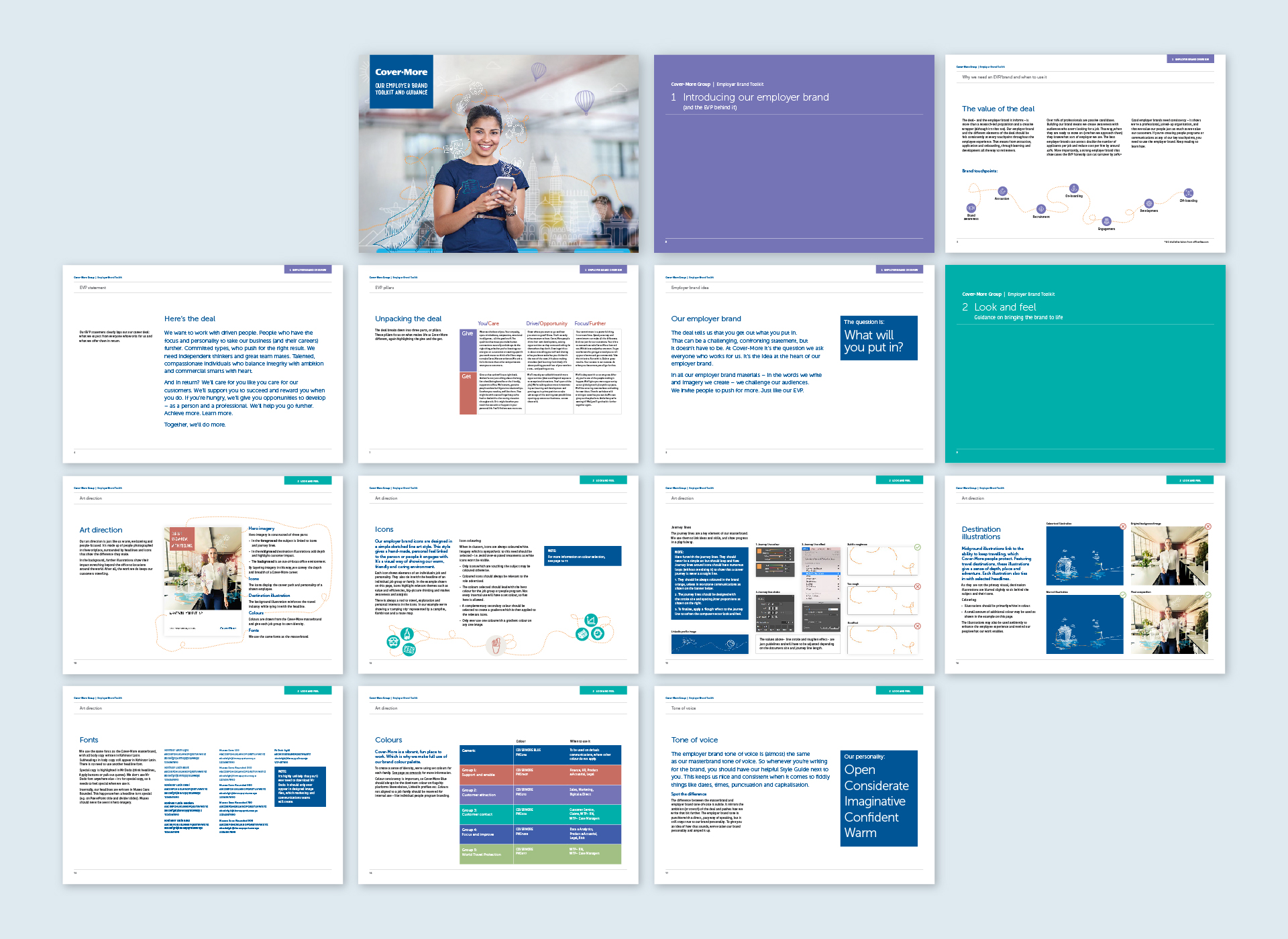
BRAND GUIDELINES ▾

Setting the goals
Although many great employee stories and initiatives were happening internally, they weren’t being communicated to inspire people across the business. In response, our strategy had to extend the reach and impact of the Cover-More employer brand and its ability to attract, engage and retain talent.
— what we looked at
1. Defining EVP
2. Setting tone of voice
3. Defining employer brand visual style
4. Enriching careers website to be more brand-led
Give more.
Get more.
The Cover-More EVP isn’t a people promise or an employee offering. It’s a deal, with a very clear set of expectations on both sides. There’s a give/get to it and as an open, honest and fair place to work, it’s OK to be upfront about that. This is the stretch.
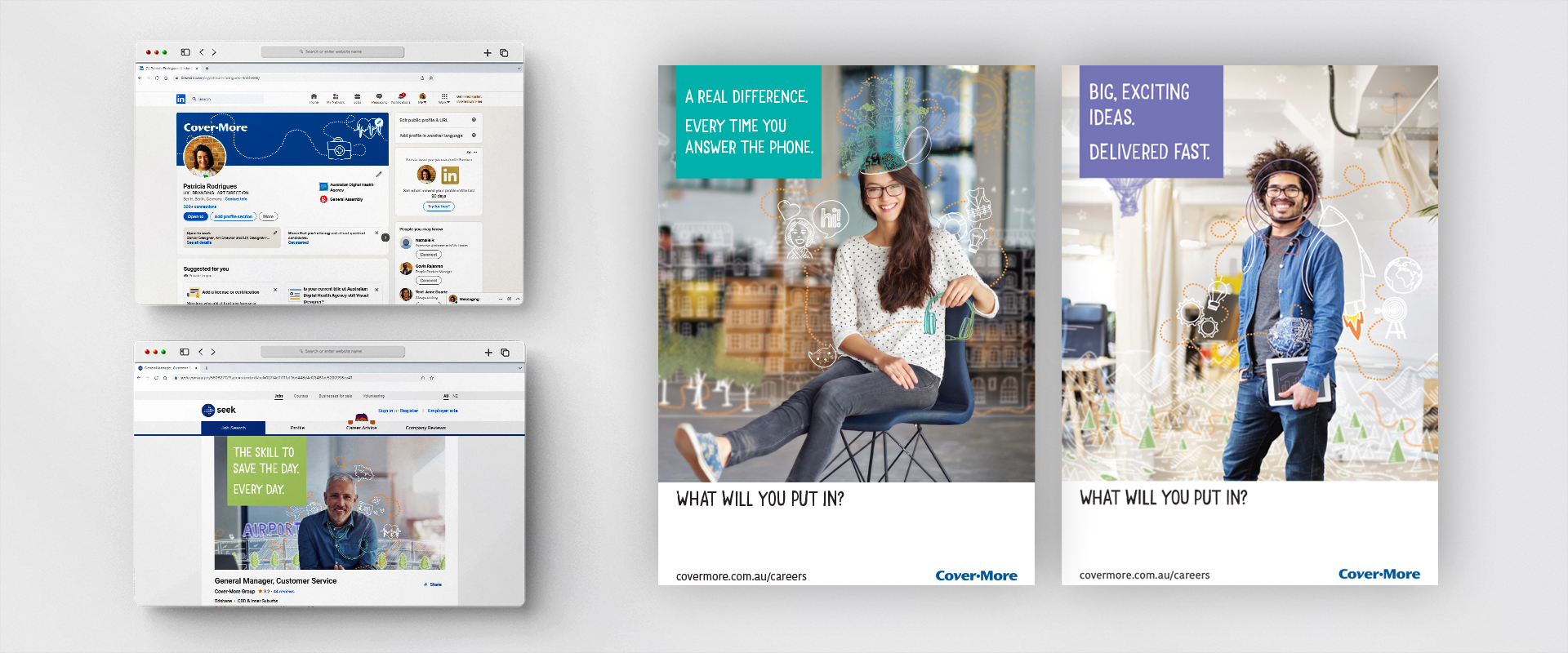
SOCIAL MEDIA, JOB ADS AND POSTERS ▾

Project development
After the brand pillars and visual style were established, I brought them to life by designing a series of collateral pieces to reach out to the many communication channels of Cover-More Group. From social media, campaign posters and internal templates to the most important piece: the careers website.
— the ideal candidate
Someone who empathises with the customer and with each other. That is aligned with Cover-More values of Compassion, Commitment and Integrity. A person who's not only self-aware but inclusive and open-minded. Someone looking for excitement but also focused on achieving business value.
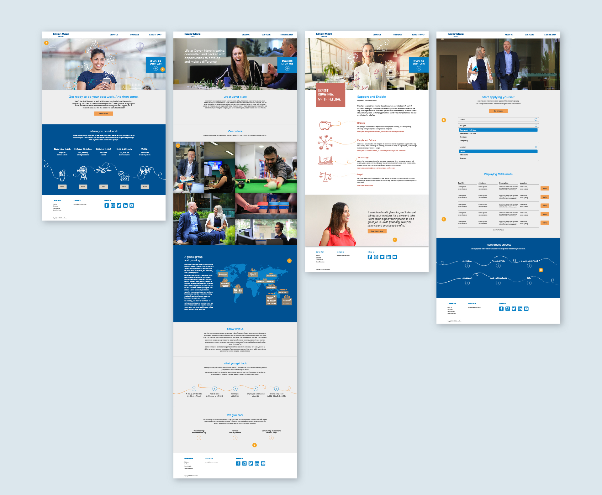
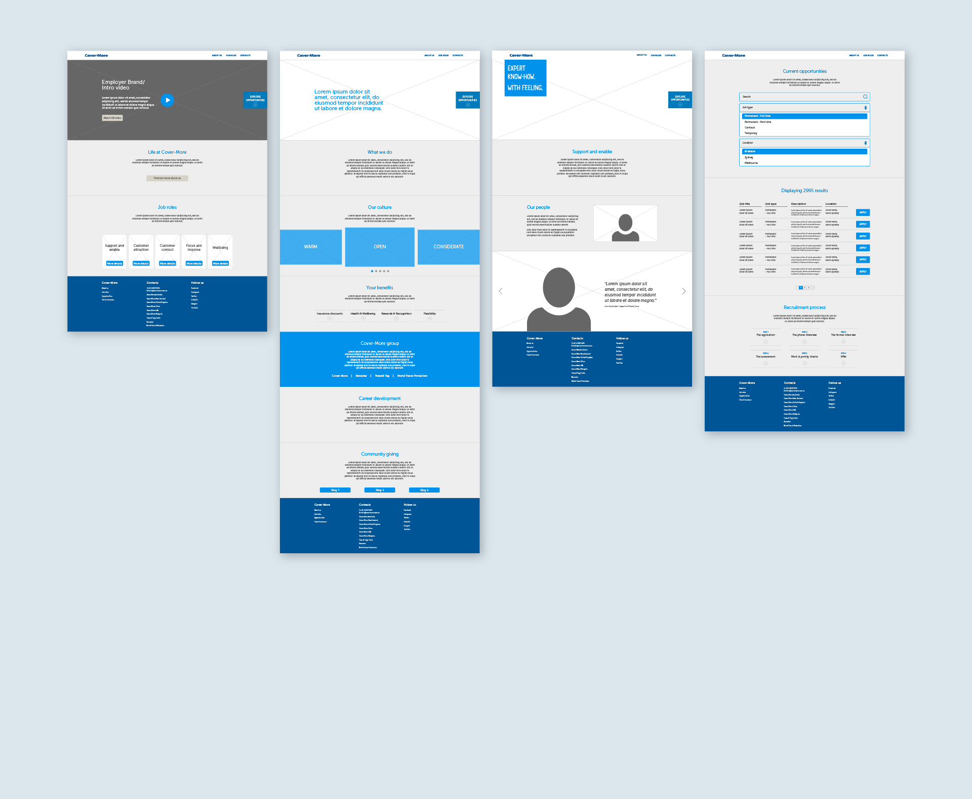
CAREERS WEBSITE – WIREFRAME VS. DESIGN
(Home, About, Job Group and Opportunities pages) ▾


The website transformation
Aligning the brand message was the starting point for the Cover-More careers website transformation. Once that was clearly defined, we (myself and the copywriter) worked in collaboration with the key stakeholders to create new content and a fresh design for the careers platform. For that, we ran several internal workshops and brainstormed ideas with the marketing and engineers' team.
— website development
1. site map adjustments
2. low-fi ideation
3. wireframing
4. content creation
5. UI design